CONTEXT
In watchmaking communication, the CEO portrait follows a predictable logic: a dark suit, a confident posture, the watch visible at the wrist. The image signals authority. It does not create meaning. For a brand whose entire identity rests on refusing convention, this approach represents a missed opportunity: the most unconventional watches in the sector, presented through the most interchangeable portraits possible.
This Case Study documents a portrait mandate for DOXA Watches, developed as a research exercise into what happens when the portrait is treated not as documentation but as visual argument.
CONCEPT & RESEARCH
The starting point was not lighting or styling. It was a question: what does a DOXA client look like? Not demographically, but attitudinally. The answer, consistent across the brand's history, is someone who buys against the grain. In 1967, when every competitor was producing black dials, DOXA tested colour visibility underwater in Lake Neuchâtel and launched orange. Not as a provocation. As a conviction.
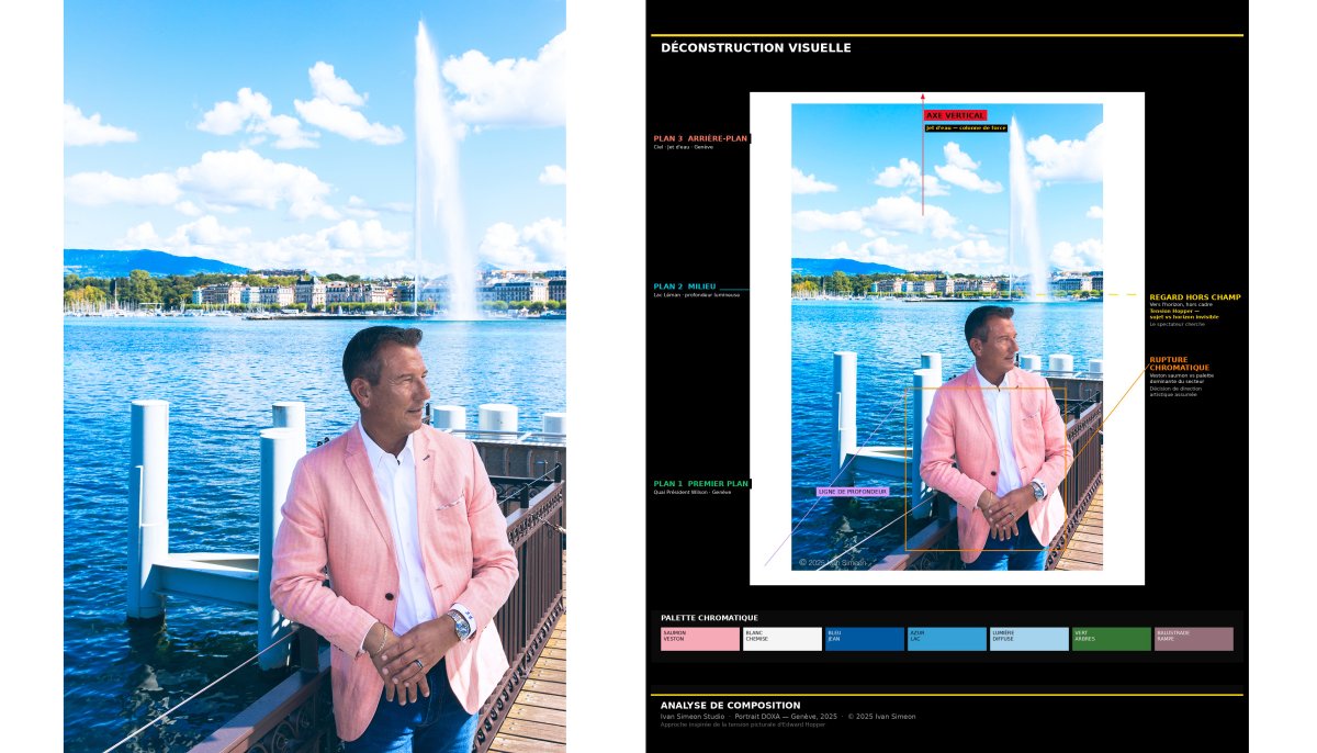
That same logic was applied to the portrait brief. The Déconstruction Visuelle framework, developed across multiple mandates, provided the analytical structure: before any image is made, the compositional forces at work in a location are mapped. Where does depth exist? What chromatic tensions are available? What does the space already argue, visually, before a subject enters it?
For the location at the Quai Président Wilson in Geneva, the analysis identified four active elements: the vertical axis of the Jet d'eau as a column of force, the luminous depth of Lac Léman as a second plane, the first-person foreground of the quai as an anchor, and the salmon blazer as a deliberate chromatic rupture against the dominant blue palette of the sector. The off-frame gaze, a reference to the pictorial tension Edward Hopper introduced into American realism, removes the subject from the frame's authority and places him in relation to something beyond it.
DEVELOPMENT & METHODOLOGY
The post-production approach was developed to serve the compositional logic rather than correct it. A specific retouching language was constructed for this series: one that treats colour as an active compositional element rather than a technical variable, and contrast as a tool for creating hierarchy rather than drama.
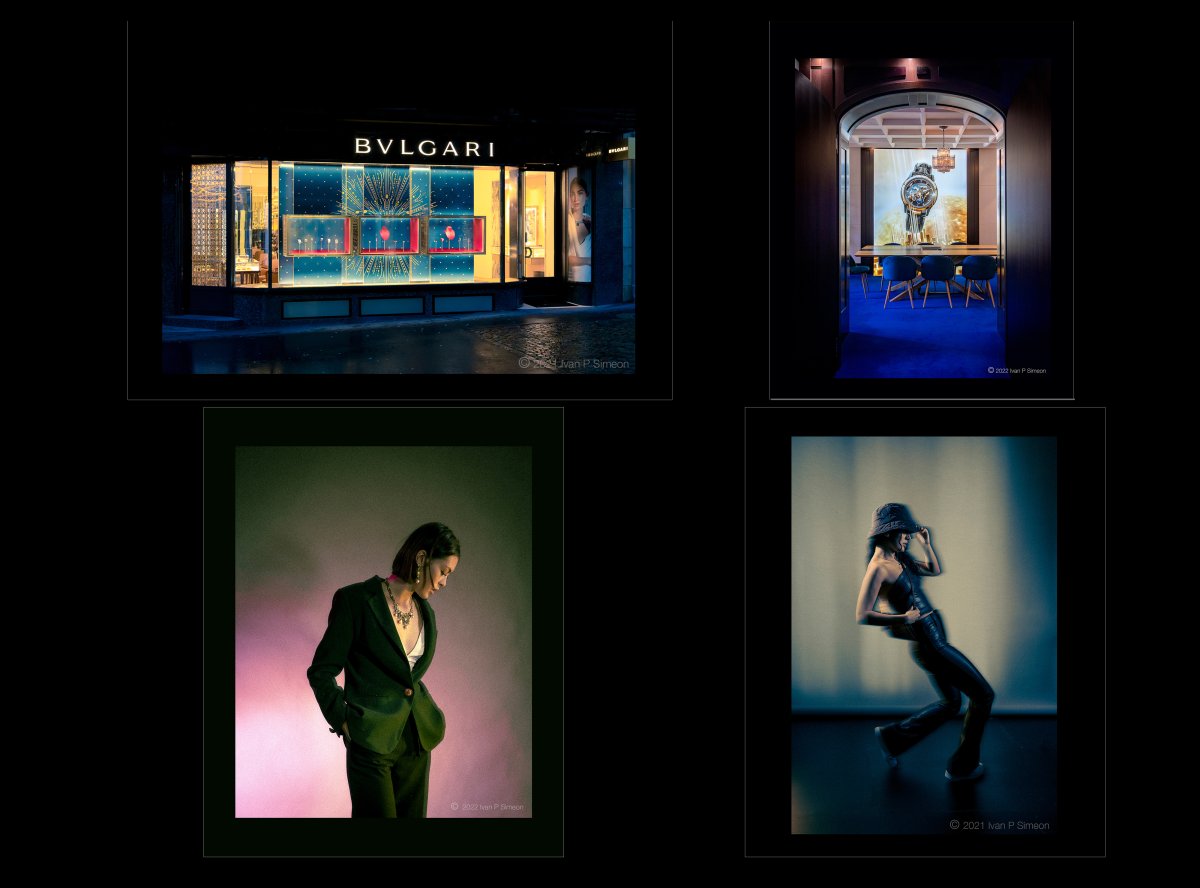
The workflow applied consistently across the full series of fifteen images separated tonal work from colour work, treating each image as a specific lighting problem rather than a generic correction task. Lifted blacks, split toning with cold shadows and warm highlights, selective desaturation of skin tones, and a global warm veil at low opacity produced a visual signature that holds across radically different locations and lighting conditions: a strobe-lit interior, a natural-light exterior, a grand staircase under ambient warmth.
Two images in the series were developed in black and white, applying the same retouching logic to a mirror composition with a crystal chandelier and a marquetry commode. The monochrome treatment was not a stylistic choice imposed from outside; it emerged from the compositional logic of each location, where the graphic complexity of the environment made colour a distraction from structure.
RESULTS
The series produced imagery that functions simultaneously as corporate portrait and editorial content. The image at the Quai Président Wilson, CEO in salmon blazer, Jet d'eau, DOXA SUB 300T visible at the wrist, operates as a visual statement about the brand's relationship to convention: Geneva as backdrop, but the gaze directed elsewhere.
The deeper outcome is methodological. When a portrait is constructed from compositional analysis rather than stylistic convention, it carries an argument. It can be read, not just seen. That distinction is the boundary between portrait photography and visual consulting.
Photographer & Art Director: Ivan Simeon
Location: Geneva, Switzerland